Tables, caselets and graphs comprise the entire CAT Data Interpretation section. Almost 16 questions are asked from Data Interpretation every year in the CAT Exam. In the paper, data caselets are given, and then some questions are asked based on the given data. The graphical representation of data or the graph questions forms the major percentage of questions in this section.
What Are Graph Questions?
In graph-related questions, a graph will be given to represent certain sets of data or to depict a relation between certain entities. The candidates are required to interpret the data given in the graph and solve the questions. There can be different types of graphs included in the CAT data interpretation section. The types of graphs are discussed below.
Types of Graphs
There are mainly 3 types of graphs that are generally included in the CAT DI section, which are line graphs, pie charts and bar graphs. These types are explained in detail here.
- Line Graphs
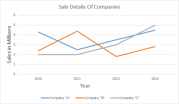
In line graphs or charts, the data points are connected by lines to depict a pattern or trend over the variable function (mostly time). Line graphs can also help to compare changes over the same period of time for varying groups. An example of a line graph is given below

In this chart, the total sales of companies A, B and C are given. From this data, questions like “calculate the average sales”, “who had the highest sales in a particular year?” etc., can be asked.
- Pie Charts
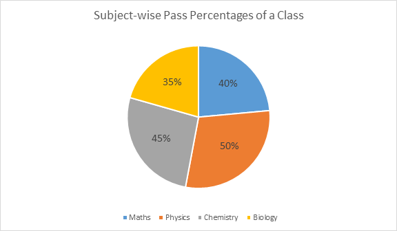
It is also called a circle graph. They are mostly used when one needs to compare parts of a whole. In general, percentages are used to represent the proportions or shares of the whole entity. These graphs do not depict changes over time and are only used to show percentages, shares or proportions. An example is given below.

In the above chart, the pass percentages of the students in a particular class are given. Questions like “how many students passed on a particular subject?”, “total students who failed in a certain subject”, etc., are commonly asked in pie chart questions.
Watch the Below Video for Decipher DI Techniques – Pie Graphs

- Bar Graphs
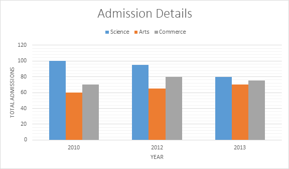
In bar graphs, different sizes and colours of bars are used to compare entities or track changes over a period of time. Bar graphs can be either vertical or horizontal and even stacked. Generally, bar graphs are used to compare when changes are larger. In a bar graph, the bars are distinct, and each bar represents a certain value. This makes the bar diagram easily understandable. An example of a bar graph is given below.

In the above bar graph, the admission details in different streams of a particular school are given. From this graph, questions like “ratio of total science and arts students over the years”, “how many times more are the admissions in the science stream in a particular year?” etc., can be asked.
These are the different types of graphs that are included in the Data Interpretation for the CAT section. It is important to know about these graphs and then practise several variations of questions to be able to tackle any graph-related question in the exam.
To get more such study materials for the CAT exam, keep visiting BYJU’S. Comment on any CAT-related query below and get complete assistance for CAT 2023 preparation.