Scatter plots are the graphs that present the relationship between two variables in a data-set. It represents data points on a two-dimensional plane or on a Cartesian system. The independent variable or attribute is plotted on the X-axis, while the dependent variable is plotted on the Y-axis. These plots are often called scatter graphs or scatter diagrams.
Scatter plot Graph
A scatter plot is also called a scatter chart, scattergram, or scatter plot, XY graph. The scatter diagram graphs numerical data pairs, with one variable on each axis, show their relationship. Now the question comes for everyone: when to use a scatter plot?
Scatter plots are used in either of the following situations.
- When we have paired numerical data
- When there are multiple values of the dependent variable for a unique value of an independent variable
- In determining the relationship between variables in some scenarios, such as identifying potential root causes of problems, checking whether two products that appear to be related both occur with the exact cause and so on.
Scatter Plot Uses and Examples
Scatter plots instantly report a large volume of data. It is beneficial in the following situations –
- For a large set of data points given
- Each set comprises a pair of values
- The given data is in numeric form

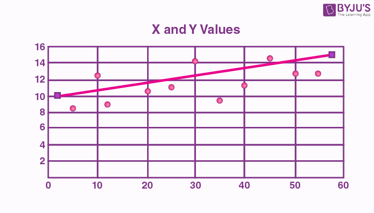
The line drawn in a scatter plot, which is near to almost all the points in the plot is known as “line of best fit” or “trend line“. See the graph below for an example.
Scatter plot Correlation
We know that the correlation is a statistical measure of the relationship between the two variables’ relative movements. If the variables are correlated, the points will fall along a line or curve. The better the correlation, the closer the points will touch the line. This cause examination tool is considered as one of the seven essential quality tools.
Types of correlation
The scatter plot explains the correlation between two attributes or variables. It represents how closely the two variables are connected. There can be three such situations to see the relation between the two variables –
- Positive Correlation
- Negative Correlation
- No Correlation
Positive Correlation
When the points in the graph are rising, moving from left to right, then the scatter plot shows a positive correlation. It means the values of one variable are increasing with respect to another. Now positive correlation can further be classified into three categories:
- Perfect Positive – Which represents a perfectly straight line
- High Positive – All points are nearby
- Low Positive – When all the points are scattered

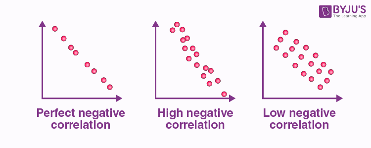
Negative Correlation
When the points in the scatter graph fall while moving left to right, then it is called a negative correlation. It means the values of one variable are decreasing with respect to another. These are also of three types:
- Perfect Negative – Which form almost a straight line
- High Negative – When points are near to one another
- Low Negative – When points are in scattered form
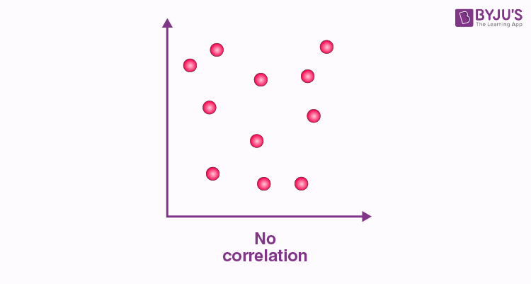
No Correlation
When the points are scattered all over the graph and it is difficult to conclude whether the values are increasing or decreasing, then there is no correlation between the variables.
Scatter plot Example
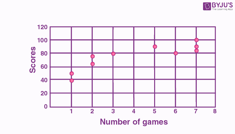
Let us understand how to construct a scatter plot with the help of the below example.
Question:
Draw a scatter plot for the given data that shows the number of games played and scores obtained in each instance.
| No. of games | 3 | 5 | 2 | 6 | 7 | 1 | 2 | 7 | 1 | 7 |
| Scores | 80 | 90 | 75 | 80 | 90 | 50 | 65 | 85 | 40 | 100 |
Solution:
X-axis or horizontal axis: Number of games
Y-axis or vertical axis: Scores
Now, the scatter graph will be:
Note: We can also combine scatter plots in multiple plots per sheet to read and understand the higher-level formation in data sets containing multivariable, notably more than two variables.
Scatter plot Matrix
For data variables such as x1, x2, x3, and xn, the scatter plot matrix presents all the pairwise scatter plots of the variables on a single illustration with various scatterplots in a matrix format. For the n number of variables, the scatterplot matrix will contain n rows and n columns. A plot of variables xi vs xj will be located at the ith row and jth column intersection. We can say that each row and column is one dimension, whereas each cell plots a scatter plot of two dimensions.