Bar graphs are the pictorial representation of data (generally grouped), in the form of vertical or horizontal rectangular bars, where the length of bars are proportional to the measure of data. They are also known as bar charts. Bar graphs are one of the means of data handling in statistics.
The collection, presentation, analysis, organization, and interpretation of observations of data are known as statistics. The statistical data can be represented by various methods such as tables, bar graphs, pie charts, histograms, frequency polygons, etc. In this article, let us discuss what is a bar chart, different types of bar graphs, uses, and solved examples.
| Table of Contents: |
What is Bar Graph?
The pictorial representation of grouped data, in the form of vertical or horizontal rectangular bars, where the lengths of the bars are equivalent to the measure of data, are known as bar graphs or bar charts.
The bars drawn are of uniform width, and the variable quantity is represented on one of the axes. Also, the measure of the variable is depicted on the other axes. The heights or the lengths of the bars denote the value of the variable, and these graphs are also used to compare certain quantities. The frequency distribution tables can be easily represented using bar charts which simplify the calculations and understanding of data.
The three major attributes of bar graphs are:
- The bar graph helps to compare the different sets of data among different groups easily.
- It shows the relationship using two axes, in which the categories are on one axis and the discrete values are on the other axis.
- The graph shows the major changes in data over time.
What Constitutes a Bar Graph?
Following are the many parts of a bar graph:
- Vertical axis
- Horizontal axis
- The bar graph’s title informs the reader of its purpose.
- The title of the horizontal axis indicates the information that is shown there.
- The title of the vertical axis indicates the data it is used to display.
- The categories on the particular axis indicate what each bar represents.
- The bar graph’s scale demonstrates how numbers are used in the data. It is a system of markings spaced at specific intervals that aid in object measurement. For instance, the scale of a graph may be stated as 1 unit = 10 fruits

Types of Bar Graphs
The bar graphs can be vertical or horizontal. The primary feature of any bar graph is its length or height. If the length of the bar graph is more, then the values are greater than any given data.
Bar graphs normally show categorical and numeric variables arranged in class intervals. They consist of an axis and a series of labelled horizontal or vertical bars. The bars represent frequencies of distinctive values of a variable or commonly the distinct values themselves. The number of values on the x-axis of a bar graph or the y-axis of a column graph is called the scale.
The types of bar charts are as follows:
- Vertical bar chart
- Horizontal bar chart
Even though the graph can be plotted using horizontally or vertically, the most usual type of bar graph used is the vertical bar graph. The orientation of the x-axis and y-axis are changed depending on the type of vertical and horizontal bar chart. Apart from the vertical and horizontal bar graph, the two different types of bar charts are:
- Grouped Bar Graph
- Stacked Bar Graph
Now, let us discuss the four different types of bar graphs.
Vertical Bar Graphs
When the grouped data are represented vertically in a graph or chart with the help of bars, where the bars denote the measure of data, such graphs are called vertical bar graphs. The data is represented along the y-axis of the graph, and the height of the bars shows the values.
Horizontal Bar Graphs
When the grouped data are represented horizontally in a chart with the help of bars, then such graphs are called horizontal bar graphs, where the bars show the measure of data. The data is depicted here along the x-axis of the graph, and the length of the bars denote the values.
Grouped Bar Graph
The grouped bar graph is also called the clustered bar graph, which is used to represent the discrete value for more than one object that shares the same category. In this type of bar chart, the total number of instances are combined into a single bar. In other words, a grouped bar graph is a type of bar graph in which different sets of data items are compared. Here, a single colour is used to represent the specific series across the set. The grouped bar graph can be represented using both vertical and horizontal bar charts.
Stacked Bar Graph
The stacked bar graph is also called the composite bar chart, which divides the aggregate into different parts. In this type of bar graph, each part can be represented using different colours, which helps to easily identify the different categories. The stacked bar chart requires specific labelling to show the different parts of the bar. In a stacked bar graph, each bar represents the whole and each segment represents the different parts of the whole.
Properties of Bar Graph
Some of the important properties of a bar graph are as follows:
- All the bars should have a common base.
- Each column in the bar graph should have equal width.
- The height of the bar should correspond to the data value.
- The distance between each bar should be the same.
Applications of Bar Graphs
Bar graphs are used to match things between different groups or to trace changes over time. Yet, when trying to estimate change over time, bar graphs are most suitable when the changes are bigger.
Bar charts possess a discrete domain of divisions and are normally scaled so that all the data can fit on the graph. When there is no regular order of the divisions being matched, bars on the chart may be organized in any order. Bar charts organized from the highest to the lowest number are called Pareto charts.
Real-Life Applications of Bar Graph
Bar graphs are a visual representation of data. They are used to show the relationship between two or more sets of data. They are mostly used in business and finance, but they can also be found in other contexts. Bar graphs are used in many real-life situations. For example, a bar graph can be used to show the distribution of different types of food in a restaurant. The height of each rectangle would represent how many orders were placed for that type of food.
Bar graphs are also often used to represent the data grouped into categories, such as how many people have voted for each candidate in an election or how much money was spent by each department. The bars on this type of graph represent the number or percentage of people or money spent and are usually stacked on top of one another so that they can be easily compared to one another.
Advantages and Disadvantages of Bar Chart
Advantages:
- Bar graph summarises the large set of data in simple visual form.
- It displays each category of data in the frequency distribution.
- It clarifies the trend of data better than the table.
- It helps in estimating the key values at a glance.
Disadvantages:
- Sometimes, the bar graph fails to reveal the patterns, cause, effects, etc.
- It can be easily manipulated to yield fake information.
Difference Between Bar Graph and Histogram
The bar graph and the histogram look similar. But it has an important difference. The major difference between them is that they plot different types of data. In the bar chart, discrete data is plotted, whereas, in the histogram, it plots the continuous data. For instance, if we have different categories of data like types of dog breeds, types of TV programs, the bar chart is best as it compares the things among different groups. For example, if we have continuous data like the weight of the people, the best choice is the histogram.
Difference Between Bar Graph and Pie Chart
A pie chart is one of the types of graphical representation. The pie chart is a circular chart and is divided into parts. Each part represents the fraction of a whole. Whereas, bar graph represents the discrete data and compares one data with the other data.
Difference Between Bar Graph and Line Graph
The major difference between bar graph and line graph are as follows:
- The bar graph represents the data using the rectangular bars and the height of the bar represents the value shown in the data. Whereas a line graph helps to show the information when the series of data are connected using a line.
- Understanding the line graph is a little bit confusing as the line graph plots too many lines over the graph. Whereas bar graph helps to show the relationship between the data quickly.
Important Notes:
Some of the important notes related to the bar graph are as follows:
- In the bar graph, there should be an equal spacing between the bars.
- It is advisable to use the bar graph if the frequency of the data is very large.
- Understand the data that should be presented on the x-axis and y-axis and the relation between the two.
How to Draw a Bar Graph?
Let us consider an example, we have four different types of pets, such as cat, dog, rabbit, and hamster and the corresponding numbers are 22, 39, 5 and 9 respectively.
In order to visually represent the data using the bar graph, we need to follow the steps given below.
- Step 1: First, decide the title of the bar graph.
- Step 2: Draw the horizontal axis and vertical axis. (For example, Types of Pets)
- Step 3: Now, label the horizontal axis.
- Step 4: Write the names on the horizontal axis, such as Cat, Dog, Rabbit, Hamster.
- Step 5: Now, label the vertical axis. (For example, Number of Pets)
- Step 6: Finalise the scale range for the given data.
- Step 7: Finally, draw the bar graph that should represent each category of the pet with their respective numbers.
Bar Graph Solved Examples
To understand the above types of bar graphs, consider the following examples:
Example 1:
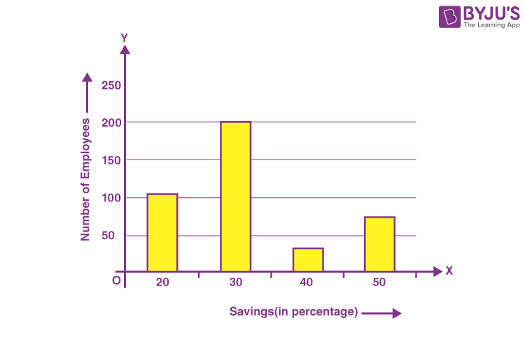
In a firm of 400 employees, the percentage of monthly salary saved by each employee is given in the following table. Represent it through a bar graph.
| Savings (in percentage) | Number of Employees(Frequency) |
| 20 | 105 |
| 30 | 199 |
| 40 | 29 |
| 50 | 73 |
| Total | 400 |
Solution:
The given data can be represented as
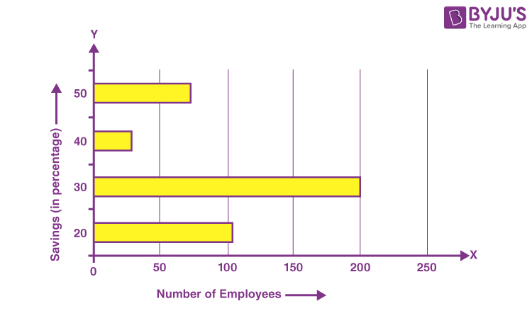
This can also be represented using a horizontal bar graph as follows:
Example 2:
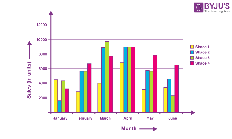
A cosmetic company manufactures 4 different shades of lipstick. The sale for 6 months is shown in the table. Represent it using bar charts.
| Month | Sales (in units) | |||
| Shade 1 | Shade 2 | Shade 3 | Shade 4 | |
| January | 4500 | 1600 | 4400 | 3245 |
| February | 2870 | 5645 | 5675 | 6754 |
| March | 3985 | 8900 | 9768 | 7786 |
| April | 6855 | 8976 | 9008 | 8965 |
| May | 3200 | 5678 | 5643 | 7865 |
| June | 3456 | 4555 | 2233 | 6547 |
Solution:
The graph given below depicts the following data
Example 3:
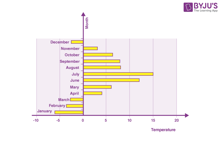
The variation of temperature in a region during a year is given as follows. Depict it through the graph (bar).
| Month | Temperature |
| January | -6°C |
| February | -3.5°C |
| March | -2.7°C |
| April | 4°C |
| May | 6°C |
| June | 12°C |
| July | 15°C |
| August | 8°C |
| September | 7.9°C |
| October | 6.4°C |
| November | 3.1°C |
| December | -2.5°C< |
Solution:
As the temperature in the given table has negative values, it is more convenient to represent such data through a horizontal bar graph.
Practice Problem
Question:
A school conducted a survey to know the favorite sports of the students. The table below shows the results of this survey.
| Name of the Sport | Total Number of Students |
| Cricket | 45 |
| Football | 53 |
| Basketball | 99 |
| Volleyball | 44 |
| Chess | 66 |
| Table Tennis | 22 |
| Badminton | 37 |
From this data,
1. Draw a graph representing the sports and the total number of students.
2. Calculate the range of the graph.
3. Which sport is the most preferred one?
4. Which two sports are almost equally preferred?
5. List the sports in ascending order.
Stay tuned with BYJU’S – The Learning App and download the app to learn all Maths-related concepts easily by exploring more videos.
Frequently Asked Questions on Bar Graph
What is meant by a bar graph?
Bar graph (bar chart) is a graph that represents the categorical data using rectangular bars. The bar graph shows the comparison between discrete categories.
What are the different types of bar graphs?
The different types of bar graphs are:
Vertical bar graph
Horizontal bar graph
Grouped bar graph
Stacked bar graph
When is a bar graph used?
The bar graph is used to compare the items between different groups over time. Bar graphs are used to measure the changes over a period of time. When the changes are larger, a bar graph is the best option to represent the data.
When to use a horizontal bar chart?
The horizontal bar graph is the best choice while graphing the nominal variables.
When to use a vertical bar chart?
The vertical bar graph is the most commonly used bar chart, and it is best to use it while graphing the ordinal variables.
this site helped me alot in my studying during lockdown as i cant understand anything in online classes . It helped me alot in making my ppt’s and compeleting my notes .
Thiz hepled me so much l am relieved.