When we display the data distribution in a standardized way using 5 summary – minimum, Q1 (First Quartile), median, Q3(third Quartile), and maximum, it is called a Box plot. It is also termed as box and whisker plot. In this article, we are going to discuss what box plox is, its applications, and how to draw box plots in detail.
Table of contents:
Definition
The method to summarize a set of data that is measured using an interval scale is called a box and whisker plot. These are maximum used for data analysis. We use these types of graphs or graphical representation to know:
- Distribution Shape
- Central Value of it
- Variability of it
A box plot is a chart that shows data from a five-number summary including one of the measures of central tendency. It does not show the distribution in particular as much as a stem and leaf plot or histogram does. But it is primarily used to indicate a distribution is skewed or not and if there are potential unusual observations (also called outliers) present in the data set. Boxplots are also very beneficial when large numbers of data sets are involved or compared.
In simple words, we can define the box plot in terms of descriptive statistics related concepts. That means box or whiskers plot is a method used for depicting groups of numerical data through their quartiles graphically. These may also have some lines extending from the boxes or whiskers which indicates the variability outside the lower and upper quartiles, hence the terms box-and-whisker plot and box-and-whisker diagram. Outliers can be indicated as individual points.
It helps to find out how much the data values vary or spread out with the help of graphs. As we need more information than just knowing the measures of central tendency, this is where the box plot helps. This also takes less space. It is also a type of pictorial representation of data.
Since, the centre, spread and overall range are immediately apparent, using these boxplots the distributions can be compared easily.
Also, Try: Box and Whisker Plot Calculator
Parts of Box Plots
Check the image below which shows the minimum, maximum, first quartile, third quartile, median and outliers.
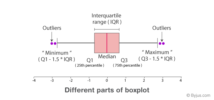
Minimum: The minimum value in the given dataset
First Quartile (Q1): The first quartile is the median of the lower half of the data set.
Median: The median is the middle value of the dataset, which divides the given dataset into two equal parts. The median is considered as the second quartile.
Third Quartile (Q3): The third quartile is the median of the upper half of the data.
Maximum: The maximum value in the given dataset.
Apart from these five terms, the other terms used in the box plot are:
Interquartile Range (IQR): The difference between the third quartile and first quartile is known as the interquartile range. (i.e.) IQR = Q3-Q1
Outlier: The data that falls on the far left or right side of the ordered data is tested to be the outliers. Generally, the outliers fall more than the specified distance from the first and third quartile.
(i.e.) Outliers are greater than Q3+(1.5 . IQR) or less than Q1-(1.5 . IQR).
Boxplot Distribution
The box plot distribution will explain how tightly the data is grouped, how the data is skewed, and also about the symmetry of data.
Positively Skewed: If the distance from the median to the maximum is greater than the distance from the median to the minimum, then the box plot is positively skewed.
Negatively Skewed: If the distance from the median to minimum is greater than the distance from the median to the maximum, then the box plot is negatively skewed.
Symmetric: The box plot is said to be symmetric if the median is equidistant from the maximum and minimum values.
Box Plot Chart
In a box and whisker plot:
- the ends of the box are the upper and lower quartiles so that the box crosses the interquartile range
- a vertical line inside the box marks the median
- the two lines outside the box are the whiskers extending to the highest and lowest observations.
Applications
It is used to know:
- The outliers and their values
- Symmetry of Data
- Tight grouping of data
- Data skewness – if, in which direction and how
Box Plot Example
Example:
Find the maximum, minimum, median, first quartile, third quartile for the given data set: 23, 42, 12, 10, 15, 14, 9.
Solution:
Given: 23, 42, 12, 10, 15, 14, 9.
Arrange the given dataset in ascending order.
9, 10, 12, 14, 15, 23, 42
Hence,
Minimum = 9
Maximum = 42
Median = 14
First Quartile = 10 (Middle value of 9, 10, 12 is 10)
Third Quartile = 23 (Middle value of 15, 23, 42 is 23).
Frequently Asked Questions on Box Plot
What is a box plot?
A box plot is a special type of diagram that shows the quartiles in a box and the line extending from the lowest to the highest value.
What is the five-number summary in the box plot?
The five-number summary in the box plot is minimum, maximum, median, first quartile, and third quartile.
When can we say that the box plot is symmetric?
The box plot is said to be symmetric if the median is equidistant from the minimum and maximum value.
Mention the two conditions that represent the outliers.
Outliers are greater than Q3+(1.5. IQR) or less than Q1-(1.5. IQR)
What are the first quartile and third quartile in the box plot?
The first quartile is the middle value of the lower half of the data, and it is represented by Q1.
The third quartile is the middle value of the upper half of the data and is represented by Q3.