The process to abstract a set of data that is estimated using an interval scale is called a box and whisker plot. It is also called just a box plot. These are mostly used for data interpretation. It is one of the types of graphical methods which displays the variation of the data in the dataset. We can also use the histogram to display the data. But, histogram provides a sufficient display. Box and whisker plot is better than histogram as a box and whisker diagram will provide additional information as it allows multiple sets of data to be displayed in the same graph. In this article, you are going to learn what a box and whiskers plot is, how to draw a box and whisker diagram in a step by step procedure with solved examples.
Table of Contents:
Box and Whisker Plot Definition
We use these box plots or graphical representation to know:
- Distribution Shape
- Central Value
- Variability
When we plot a graph for the box plot, we outline a box from the first quartile to the third quartile. A vertical line that goes through the box is the median. The whiskers (small lines) go from each quartile towards the minimum or maximum value, as shown in the figure below.
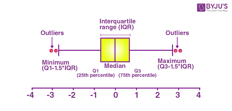
A box and whisker plot is a graph that exhibits data from a five-number summary, including one of the measures of central tendency. It does not display the distribution as accurately as a stem and leaf plot or histogram does. But, it is principally used to show whether a distribution is skewed or not and if there are potential unusual observations present in the data set, which are also called outliers. Boxplots are also very useful when huge numbers of data collections are involved or compared.
Since the centre, spread and overall range are instantly apparent, using these boxplots the arrangements can be matched easily.
A box and whisker plot is a way of compiling a set of data outlined on an interval scale. It is also used for descriptive data interpretation.
The box and whisker plot displays how the data is spread out. In the box and whisker diagram, it has five pieces of information,(also called a five-number summary).
Elements of a Box and Whisker Plot
The elements required to construct a box and whisker plot outliers are given below.
Minimum value (Q0 or 0th percentile)
First quartile (Q1 or 25th percentile)
Median (Q2 or 50th percentile)
Third quartile (Q3 or 75th percentile)
Maximum value (Q4 or 100th percentile)
Interquartile range
The meaning of each of these elements is listed below.
- The minimum value in the dataset, which is displayed at the far left end of the diagram.
- The first quartile (Q1) at the left side, which is in between the minimum value and median.
- The median value, represented by the line in the center of the box.
- The third quartile (Q3) at the right side, which is in between the median and the maximum value.
- The maximum value in the dataset, which is displayed at the far right end of the diagram.
- Interquartile range (IQR) is the difference between upper and lower quartiles, i.e. Q3 and Q1.
Also, read:
Why Do We Use Box and Whisker Plot?
Box and Whisker diagrams allow us to read the data very effectively and easily. It summarises the data from multiple sources and displays it in a single graph. It helps us to make an effective decision as it compares the data from different categories.
When to Use Box and Whisker Plot?
The box and whisker plot is used if we have multiple datasets from different sources which are related to each other. For example, a test score between classrooms.
How to Draw a Box and Whisker Plot?
The box and whiskers plot can be drawn using five simple steps. To draw a box and whisker diagram, we need to find:
Step 1: The smallest value in the data is called the minimum value.
Step 2: The value below the lower 25% of data contained, called the first quartile.
Step 3: Median value from the given set of data.
Step 4: The value above the lower 25% of data contained, called the third quartile.
Step 5: The largest value in the dataset is called maximum value.
Box and Whisker Plot Solved Example
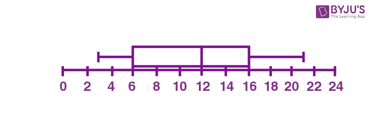
Example: Draw the box plot for the given set of data: {3, 7, 8, 5, 12, 14, 21, 13, 18}.
Solution:
Firstly, write the given data in increasing order.
3, 5, 7, 8, 12, 13, 14, 18, 21
Range = Maximum value – Minimum value
Range = 21 – 3 = 18
Now, Median = center value of the given data
Median = 12
Now, we need to find the quartiles.
First quartile = Q1 = Median of data values present at the left side of Median
Q1 = Median of (3, 5, 7, 8)
Q1 = (5+7)/2 = 12/2 = 6
Third quartile = Q3 = Median of data values present at the right side of Median
Q3 = Median of (13, 14, 18, 21)
Q3 = (14+18)/2 = 32/2 = 16
Therefore, the interquartile range = Q3 – Q1 = 16 – 6 = 10
The five-number summary is given by:
Minimum, Q1, Median, Q3, Maximum
Hence, 3, 6, 12, 16, 21 is the five-number summary for the given data.
Now, we can draw the box and whisker plot, based on the five-number summary.
Box and Whisker Plot Practice Problems
Solve these problems to understand the concept of the box plot.
- Draw a box plot for the given set of data {3, 7, 8, 5, 12, 14, 21, 15, 18, 14}.
- Find the five-number summary for the given set of data {25, 28, 29, 29, 30, 34, 35, 35, 37, 38}.
Watch The Below Video To Learn How to Find the Median of Data

Frequently Asked Questions on Box and Whisker Plot
What is Box and Whisker Plot?
Box and whisker plot is one type of graphical representation which shows the five-number summary for the given set of data, such as minimum value, lower quartile, median, upper quartile, maximum value.
Mention the advantages of Box Plot
The advantages of the box and whisker plot is that:
We can easily identify the data location and data spread.
It provides the skewness and symmetry of data
Box and whisker plot shows the data outliers.
What are the disadvantages of using Box and Whisker Plot?
The disadvantages of a box and whisker plot is that
It hides the multimodality and some other characteristics of distributions.
It confuses the audience sometimes
Mean cannot be easily located.
What is meant by an outlier in a box plot?
In the box and whisker plot, some data are located outside of the box and the whisker plot, which is numerically different from the rest of the data in the dataset, is called outliers.
How to Draw Box and whisker plot?
Arrange the data values in the ascending order
Identify the minimum and maximum values
Find the median of the data set
Identify the upper and lower quartile
Finally, construct the box and whisker plot
Great info. Easy to understand,