In statistics, a histogram is a graphical representation of the distribution of data. The histogram is represented by a set of rectangles, adjacent to each other, where each bar represent a kind of data. Statistics is a stream of mathematics that is applied in various fields. When numerals are repeated in statistical data, this repetition is known as Frequency and which can be written in the form of a table, called a frequency distribution. A Frequency distribution can be shown graphically by using different types of graphs and a Histogram is one among them. In this article, let us discuss in detail about what is a histogram, how to create the histogram for the given data, different types of the histogram, and the difference between the histogram and bar graph in detail.
| Table of Contents: |
What is Histogram?
A histogram is a graphical representation of a grouped frequency distribution with continuous classes. It is an area diagram and can be defined as a set of rectangles with bases along with the intervals between class boundaries and with areas proportional to frequencies in the corresponding classes. In such representations, all the rectangles are adjacent since the base covers the intervals between class boundaries. The heights of rectangles are proportional to corresponding frequencies of similar classes and for different classes, the heights will be proportional to corresponding frequency densities.
In other words, a histogram is a diagram involving rectangles whose area is proportional to the frequency of a variable and width is equal to the class interval.
How to Plot Histogram?
You need to follow the below steps to construct a histogram.
- Begin by marking the class intervals on the X-axis and frequencies on the Y-axis.
- The scales for both the axes have to be the same.
- Class intervals need to be exclusive.
- Draw rectangles with bases as class intervals and corresponding frequencies as heights.
- A rectangle is built on each class interval since the class limits are marked on the horizontal axis, and the frequencies are indicated on the vertical axis.
- The height of each rectangle is proportional to the corresponding class frequency if the intervals are equal.
- The area of every individual rectangle is proportional to the corresponding class frequency if the intervals are unequal.
Although histograms seem similar to graphs, there is a slight difference between them. The histogram does not involve any gaps between the two successive bars.
When to Use Histogram?
The histogram graph is used under certain conditions. They are:
- The data should be numerical.
- A histogram is used to check the shape of the data distribution.
- Used to check whether the process changes from one period to another.
- Used to determine whether the output is different when it involves two or more processes.
- Used to analyse whether the given process meets the customer requirements.
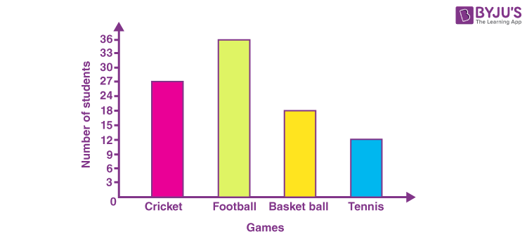
Difference Between Bar Graph and Histogram
A histogram is one of the most commonly used graphs to show the frequency distribution. As we know that the frequency distribution defines how often each different value occurs in the data set. The histogram looks more similar to the bar graph, but there is a difference between them. The list of differences between the bar graph and the histogram is given below:
| Histogram | Bar Graph |
| It is a two-dimensional figure | It is a one-dimensional figure |
| The frequency is shown by the area of each rectangle | The height shows the frequency and the width has no significance. |
| It shows rectangles touching each other | It consists of rectangles separated from each other with equal spaces. |
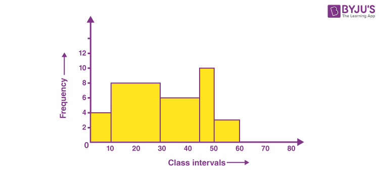
The above differences can be observed from the below figures:
Bar Graph (Gaps between bars)
Histogram (No gaps between bars)
Types of Histogram
The histogram can be classified into different types based on the frequency distribution of the data. There are different types of distributions, such as normal distribution, skewed distribution, bimodal distribution, multimodal distribution, comb distribution, edge peak distribution, dog food distribution, heart cut distribution, and so on. The histogram can be used to represent these different types of distributions. The different types of a histogram are:
- Uniform histogram
- Symmetric histogram
- Bimodal histogram
- Probability histogram
Uniform Histogram
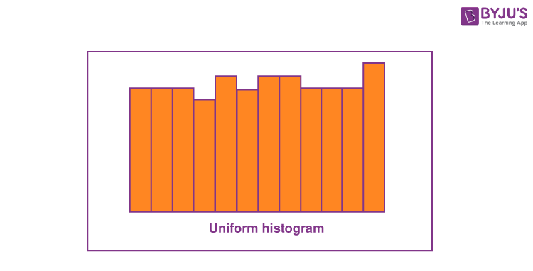
A uniform distribution reveals that the number of classes is too small, and each class has the same number of elements. It may involve distribution that has several peaks.
Bimodal Histogram
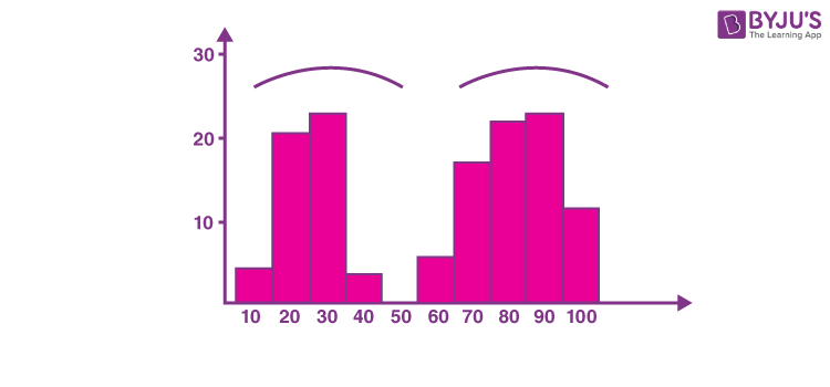
If a histogram has two peaks, it is said to be bimodal. Bimodality occurs when the data set has observations on two different kinds of individuals or combined groups if the centers of the two separate histograms are far enough to the variability in both the data sets.
Symmetric Histogram
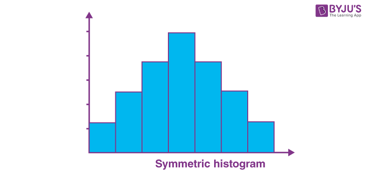
A symmetric histogram is also called a bell-shaped histogram. When you draw the vertical line down the center of the histogram, and the two sides are identical in size and shape, the histogram is said to be symmetric. The diagram is perfectly symmetric if the right half portion of the image is similar to the left half. The histograms that are not symmetric are known as skewed.
Probability Histogram
A Probability Histogram shows a pictorial representation of a discrete probability distribution. It consists of a rectangle centered on every value of x, and the area of each rectangle is proportional to the probability of the corresponding value. The probability histogram diagram is begun by selecting the classes. The probabilities of each outcome are the heights of the bars of the histogram.
Applications of Histogram
The applications of histograms can be seen when we learn about different distributions.
Normal Distribution
The usual pattern that is in the shape of a bell curve is termed normal distribution. In a normal distribution, the data points are most likely to appear on a side of the average as on the other. It is to be noted that other distributions appear the same as the normal distribution. The calculations in statistics are utilised to prove a distribution that is normal. It is required to make a note that the term “normal” explains the specific distribution for a process. For instance, in various processes, they possess a limit that is natural on a side and will create distributions that are skewed. This is normal which means for the processes, in the case where the distribution isn’t considered normal.
Skewed Distribution
The distribution that is skewed is asymmetrical as a limit which is natural resists end results on one side. The peak of the distribution is the off-center in the direction of the limit and a tail that extends far from it. For instance, a distribution consisting of analyses of a product that is unadulterated would be skewed as the product cannot cross more than 100 per cent purity. Other instances of natural limits are holes that cannot be lesser than the diameter of the drill or the call-receiving times that cannot be lesser than zero. The above distributions are termed right-skewed or left-skewed based on the direction of the tail.
Multimodal Distribution
The alternate name for the multimodal distribution is the plateau distribution. Various processes with normal distribution are put together. Since there are many peaks adjacent together, the tip of the distribution is in the shape of a plateau.
Edge peak Distribution
This distribution resembles the normal distribution except that it possesses a bigger peak at one tail. Generally, it is due to the wrong construction of the histogram, with data combined together into a collection named “greater than”.
Comb Distribution
In this distribution, there exist bars that are tall and short alternatively. It mostly results from the data that is rounded off and/or an incorrectly drawn histogram. For instance, the temperature that is rounded off to the nearest 0.2o would display a shape that is in the form of a comb provided the width of the bar for the histogram were 0.1o.
Truncated or Heart-Cut Distribution
The above distribution resembles a normal distribution with the tails being cut off. The producer might be manufacturing a normal distribution of product and then depending on the inspection to segregate what lies within the limits of specification and what is out. The resulting parcel to the end-user from within the specifications is heart cut.
Dog Food Distribution
This distribution is missing something. It results close by the average. If an end-user gets this distribution, someone else is receiving a heart cut distribution and the end-user who is left gets dog food, the odds and ends which are left behind after the meal of the master. Even if the end-user receives within the limits of specifications, the item is categorised into 2 clusters namely – one close to the upper specification and another close to the lesser specification limit. This difference causes problems in the end-users process.
Related Articles
Histogram Solved Example
Question: The following table gives the lifetime of 400 neon lamps. Draw the histogram for the below data.
| Lifetime (in hours) | Number of lamps |
| 300 – 400 | 14 |
| 400 – 500 | 56 |
| 500 – 600 | 60 |
| 600 – 700 | 86 |
| 700 – 800 | 74 |
| 800 – 900 | 62 |
| 900 – 1000 | 48 |
Solution:
The histogram for the given data is:

Video Lesson
Frequently Asked Questions on Histogram
Are histogram and bar chart the same?
No, histograms and bar charts are different. In the bar chart, each column represents the group which is defined by a categorical variable, whereas in the histogram each column is defined by the continuous and quantitative variable.
Which histogram represents the consistent data?
The uniform shaped histogram shows consistent data. In the uniform histogram, the frequency of each class is similar to one other. In most cases, the data values in the uniform shaped histogram may be multimodal.
Can a histogram be drawn for the normally distributed data?
Yes, the histogram can be drawn for the normal distribution of the data. A normal distribution should be perfectly symmetrical around its center. It means that the right should be the mirror image of the left side about its center and vice versa.
When a histogram is skewed to right?
A histogram is skewed to the right, if most of the data values are on the left side of the histogram and a histogram tail is skewed to right. When the data are skewed to the right, the mean value is larger than the median of the data set.
When a histogram is skewed to the left?
A histogram is skewed to the left, if most of the data values fall on the right side of the histogram and a histogram tail is skewed to left. In this case, the mean value is smaller than the median of the data set.
To know more about histograms, graphs and other statistical concepts, visit BYJU’S -The Learning App today!
Comments