A pie chart is a type of graph that represents the data in the circular graph. The slices of pie show the relative size of the data, and it is a type of pictorial representation of data. A pie chart requires a list of categorical variables and numerical variables. Here, the term “pie” represents the whole, and the “slices” represent the parts of the whole.

| Table of Contents: |
What is a Pie Chart?
The “pie chart” is also known as a “circle chart”, dividing the circular statistical graphic into sectors or sections to illustrate the numerical problems. Each sector denotes a proportionate part of the whole. To find out the composition of something, Pie-chart works the best at that time. In most cases, pie charts replace other graphs like the bar graph, line plots, histograms, etc.
Formula
The pie chart is an important type of data representation. It contains different segments and sectors in which each segment and sector of a pie chart forms a specific portion of the total(percentage). The sum of all the data is equal to 360°.
The total value of the pie is always 100%.
To work out with the percentage for a pie chart, follow the steps given below:
- Categorize the data
- Calculate the total
- Divide the categories
- Convert into percentages
- Finally, calculate the degrees
Therefore, the pie chart formula is given as
(Given Data/Total value of Data) × 360°
Note: It is not mandatory to convert the given data into percentages until it is specified. We can directly calculate the degrees for given data values and draw the pie chart accordingly.
How to Create a Pie Chart?
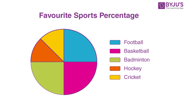
Imagine a teacher surveys her class on the basis of favourite Sports of students:
| Football | Hockey | Cricket | Basketball | Badminton |
| 10 | 5 | 5 | 10 | 10 |
The data above can be represented by a pie chart as following and by using the circle graph formula, i.e. the pie chart formula given below. It makes the size of the portion easy to understand.
Step 1: First, Enter the data into the table.
| Football | Hockey | Cricket | Basketball | Badminton |
| 10 | 5 | 5 | 10 | 10 |
Step 2: Add all the values in the table to get the total.
I.e. Total students are 40 in this case.
Step 3: Next, divide each value by the total and multiply by 100 to get a per cent:
| Football | Hockey | Cricket | Basketball | Badminton |
| (10/40) × 100
=25% |
(5/ 40) × 100
=12.5% |
(5/40) ×100
=12.5% |
(10/ 40) ×100
=25% |
(10/40)× 100
=25% |
Step 4: Next to know how many degrees for each “pie sector” we need, we will take a full circle of 360° and follow the calculations below:
The central angle of each component = (Value of each component/sum of values of all the components)✕360°
| Football | Hockey | Cricket | Basketball | Badminton |
| (10/ 40)× 360°
=90° |
(5 / 40) × 360°
=45° |
(5/40) × 360°
=45° |
(10/ 40)× 360°
=90° |
(10/ 40) × 360°
=90° |
Now you can draw a pie chart.
Step 5: Draw a circle and use the protractor to measure the degree of each sector.
Let us take an example for a pie chart with an explanation here to understand the concept in a better way.
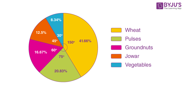
Question: The percentages of various cops cultivated in a village of particular distinct are given in the following table.
| Items | Wheat | Pulses | Jowar | Groundnuts | Vegetables | Total |
| Percentage of cops | 125/3 | 125/6 | 25/2 | 50/3 | 25/3 | 100 |
Represent this information using a pie-chart.
Solution:
The central angle = (component value/100) × 360°
The central angle for each category is calculated as follows
| Items | Percentage of cops | Central angle |
| Wheat | 125/3 | [(125/3)/100] × 360° = 150° |
| Pulses | 125/6 | [(125/6)/100] × 360° = 75° |
| Jowar | 25/2 | [(25/2)/100] × 360° = 45° |
| Groundnuts | 50/3 | [(50/3)/100] × 360° = 60° |
| Vegetables | 25/3 | [(25/3)/100] × 360° = 30° |
| Total | 100 | 360° |
Now, the pie-chart can be constructed by using the given data.
Steps to construct:
Step 1: Draw the circle of an appropriate radius.
Step 2: Draw a vertical radius anywhere inside the circle.
Step 3: Choose the largest central angle. Construct a sector of a central angle, whose one radius coincides with the radius drawn in step 2, and the other radius is in the clockwise direction to the vertical radius.
Step 4: Construct other sectors representing other values in the clockwise direction in descending order of magnitudes of their central angles.
Step 5: Shade the sectors obtained by different colours and label them as shown in the figure below.
Pie Chart Maker
Till now you understood how to draw a pie chart for the given data using geometric tools. In this section, you will know how to make the pie chart using an online tool. People often use a graphing feature in excel sheets to get the desired pie chart. However, we have provided an online pie chart maker.
Click here to get the pie chart calculator.
How to Solve Pie Chart Questions?
In this section, you will learn how to solve or interpret the pie chart to get the original values. For this, we need to check whether the given chart is given in percentages, degrees or without any value. Based on this information, we can solve the questions related to pie charts. Let’s have a look at the solved example to understand this thoroughly.
Question:
The pie-chart shows the marks obtained by a student in an examination. If the student secures 440 marks in all, calculate the marks in each of the given subjects.
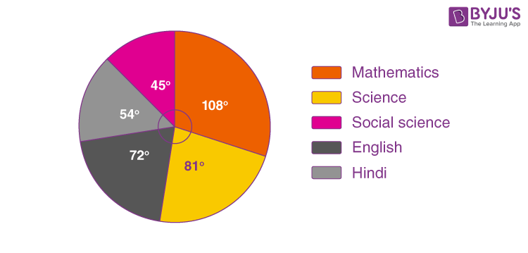
Solution:
The given pie chart shows the marks obtained in the form of degrees.
Given, total marks obtained = 440
i.e. 360 degrees = 440 marks
Now, we can calculate the marks obtained in each subject as follows.
Marks secured in mathematics = (central angle of maths/ 360°) × Total score secured
= (108°/ 360°) × 440 = 132 marks
Marks secured in science = (central angle of science / 360°) × Total score secured
= (81°/ 360°) × 440 = 99 marks
Marks secured in English = (central angle of English/ 360°) × Total score secured
= (72°/ 360°) × 440 = 88 marks
Marks secured in Hindi = (central angle of Hindi / 360°) × Total score secured
= (54°/ 360°) × 440 = 66 marks
Marks secured in social science = (central angle of social science / 360°) × Total score secured
= (45°/ 360°) × 440 = 55 marks
This can be tabulated as:
| Subject | Mathematics | Science | English | Hindi | Social science | Total |
| Marks | 132 | 99 | 88 | 66 | 55 | 440 |
Examples
A pie chart can be used to represent the relative size of a variety of data such as:
- The type of houses (1bhk, 2bhk, 3bhk, etc.) people have
- Types of 2 wheelers or 4 wheelers people have
- Number of customers a retail market has in all weekdays
- Weights of students in a class
- Types of cuisine liked by different people in an event
- Monthly expenditure of a family, etc.
Uses of Pie Chart
- Within a business, it is used to compare areas of growth, such as turnover, profit and exposure.
- To represent categorical data.
- To show the performance of a student in a test, etc.
Also, check some important topics here:
Advantages
- The picture is simple and easy-to-understand
- Data can be represented visually as a fractional part of a whole
- It helps in providing an effective communication tool for the even uninformed audience
- Provides a data comparison for the audience at a glance to give an immediate analysis or to quickly understand information
- No need for readers to examine or measure underlying numbers themselves, which can be removed by using this chart
- To emphasize a few points you want to make, you can manipulate pieces of data in the pie chart
Disadvantages
- It becomes less effective if there are too many pieces of data to use
- If there are too many pieces of data. Even if you add data labels and numbers may not help here, they themselves may become crowded and hard to read
- As this chart only represents one data set, you need a series to compare multiple sets
- This may make it more difficult for readers when it comes to analyze and assimilate information quickly
You can practice another pie chart question for Class 8, given below:
Practice Problem
Question: Priya lists down her monthly expenditure as follows:
| Expenditure | Amount |
| Rent | 4000 |
| Food | 5400 |
| Clothing | 2800 |
| Savings | 400 |
Draw a pie chart for her monthly expenses.
You might also like to practice some more Mathematical topics. Download BYJU’S- The Learning App for a variety of topics and concepts to learn.
Frequently Asked Questions – FAQs
What is a pie chart?
Why do we use pie charts?
How to calculate the percentage of data in the pie chart?
How to find the total number of pieces of data in a slice of a pie chart?
For example, a slice of the pie chart is equal to 60% and the pie chart contains a total data set of 150. Then, the value of 60% of pie slice is: (60×150)/100 = 90.
What are the examples of a pie chart?
Representation of marks obtained by students in a class
Representation of kinds of cars sold in a month
To show the type of food liked by people in a room

very helpful example.
Thank you so much for your support
Wow one of the clearest online math examples