There are different types of graphs in mathematics and statistics which are used to represent data in a pictorial form. Among the various types of charts or graphs, the most common and widely used ones are explained below.
Table of Contents:
- Types of Graphs and Charts
- Statistical graphs
- Types of Statistical graphs
- Exponential graphs
- Logarithmic graphs
- Trigonometric graphs
- Frequency distribution graph
Types of Graphs and Charts
The list of most commonly used graph types are as follows:
- Statistical Graphs (bar graph, pie graph, line graph, etc.)
- Exponential Graphs
- Logarithmic Graphs
- Trigonometric Graphs
- Frequency Distribution Graph
All these graphs are used in various places to represent a specific set of data concisely. The details of each of these graphs (or charts) are explained below in detail which will not only help to know about these graphs better but will also help to choose the right kind of graph for a particular data set.
Statistical Graphs
A statistical graph or chart is defined as the pictorial representation of statistical data in graphical form. The statistical graphs are used to represent a set of data to make it easier to understand and interpret statistical information. The different types of graphs that are commonly used in statistics are given below.
Types of Graphs in Statistics
The four basic graphs used in statistics include bar, line, histogram and pie charts. These are explained here in brief.
Bar Graph
Bar graphs are the pictorial representation of grouped data in vertical or horizontal rectangular bars, where the length of bars is proportional to the measure of data. The chart’s horizontal axis represents categorical data, whereas the chart’s vertical axis defines discrete data.
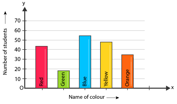
Click here to know more about bar graphs and its types.
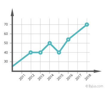
Line Graph
A graph that utilizes points and lines to represent change over time is defined as a line graph. In other words, it is a chart that shows a line joining several points or a line that shows the relation between the points. The diagram depicts quantitative data between two changing variables with a straight line or curve that joins a series of successive data points. Linear charts compare these two variables on a vertical and horizontal axis.
Histogram
A histogram chart displays the frequency of discrete and continuous data in a dataset using connected rectangular bars. Here, the number of observations that fall into a predefined class interval represented by a rectangular bar.
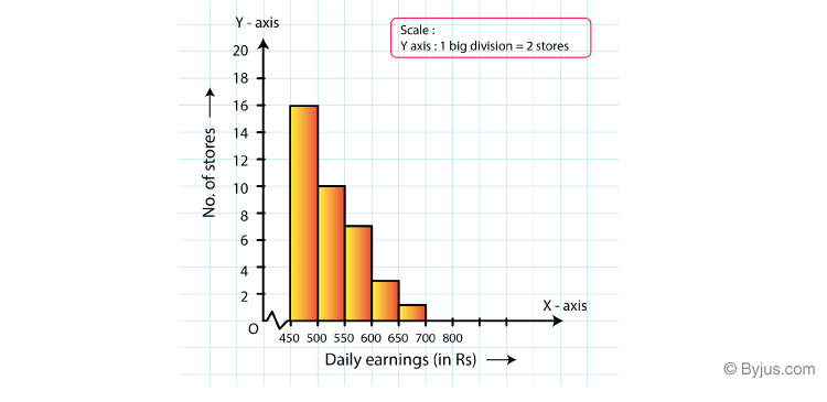
Learn more about histogram and its type here.
Pie Chart
A pie chart used to represent the numerical proportions of a dataset. This graph involves dividing a circle into various sectors, where each sector represents the proportion of a particular element as a whole. This is also called a circle chart or circle graph.
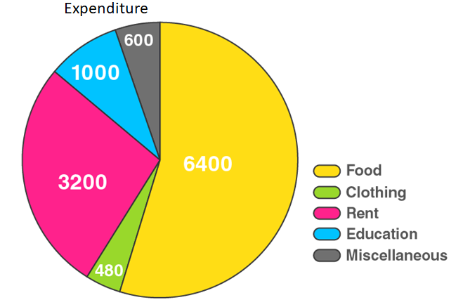
Click here to know more about pie charts along with the advantages and disadvantages.
Exponential Graphs
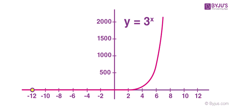
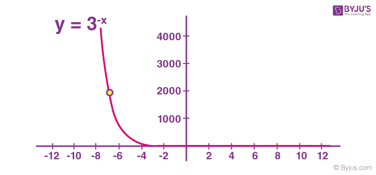
Exponential graphs are the representation of exponential functions using the table of values and plotting the points on a graph paper. It should be noted that the exponential functions are the inverse of logarithmic functions. In the case of exponential charts, the graph can be an increasing or decreasing type of curve based on the function. An example is given below, which will help to understand the concept of graphing exponential function easily.
For example, the graph of y = 3x is an increasing one while the graph of y = 3-x is a decreasing one.
Graph of y = 3x:
Logarithmic Graphs
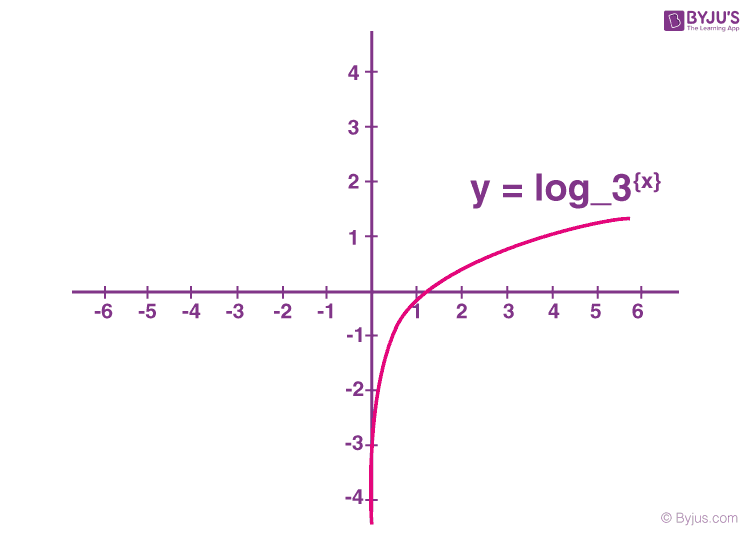
Logarithmic functions are inverse of exponential functions and the methods of plotting them are similar. To plot logarithmic graphs, it is required to make a table of values and then plot the points accordingly on a graph paper. The graph of any log function will be the inverse of an exponential function. An example is given below for better understanding.
For example, the inverse graph of y = 3x will be y = log3 {x} which will be as follows:
Trigonometric Graphs
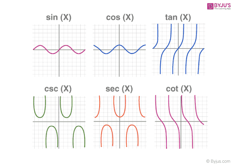
Trigonometry graphs are plotted below for the 6 trigonometric functions, which include sine function, cosine function, tangent function, cotangent function, cosec function, and sec function. Visit trigonometry graphs to learn the graphs of each of the functions in detail along with their maximum and minimum values and solved examples.
Also Check: Inverse Trigonometric Graphs
Frequency Distribution Graph
A frequency distribution graph is used to show the frequency of the outcomes in a particular sample. For frequency distribution graphs, the table of values made by placing the outcomes in one column and the number of times they appear (i.e. frequency) in the other column. This table is known as the frequency distribution table from which the cumulative frequency graph or ogive can be plotted.
There are two commonly used frequency graphs which include:
More Topics Related to Graphs:
Stay tuned with BYJU’S to get more such maths-related articles and learn the concepts more effectively. At BYJU’S, students can also get various study materials like notes, solutions, question papers, sample papers, important questions, video lessons, etc.

Thank you for the useful information