Pareto chart is also called a Pareto diagram and Pareto analysis. It is named for the Italian economist Vilfredo Pareto, who described Pareto principle, according to which roughly 80% of the outcomes come from 20% of the conditions, for many events. This assumption is used in calculations of business profit or population of any country. Hence, it is a part of probability and statistics.
Table of contents:
What is Pareto Chart?
A Pareto chart is a bar graph or the combination of bar and line graphs. The purpose of using this chart is to represent a set of data in a bar graph chart. The individual values are represented by the length of the bars and the line shows the combined total. The values are expressed from the longest bar to the shortest bar in the graph. These charts are also created using the excel sheets. Basically these graphs give statistical information on a bulk of information for each category. Hence, it is a part of Mathematical statistics.
| Also, read: |
Pareto Chart Analysis and Interpretation
Let us learn how to make use of the Pareto chart for various applications.
- Firstly, determine the classifications you will use to arrange the items in the bar graph.
- Choose an appropriate measurement such as frequency, quantity, cost and time.
- Decide the time period for the Pareto chart for which the bar graph will be drawn, For example, for a week, a month or a year.
- Assemble the new data and already existing data as per the category and period of time.
- Do the total of the measurements for all the categories.
- Choose the proper scale for the measurements you have assembled. The total you made in the above step will be the maximum value.
- Now for each category construct the bars along with labelling it. The longest bar should be placed at the leftmost place and shortest at the rightmost.
Applications of Pareto Chart
Pareto charts are the best chart to do the analysis of the bulk of data. In business industries, these charts are used very often. Let us see some of its more applications.
- For the analysis of the revenue growth of the organisation with respect to the time period.
- To choose for any specific data and work on it, in a broad set of data available.
- To explain to other people the set of data you have.
- For the analysation of population growth in a city or country or all over the world every year.
- To check the global problems and focus on resolving the major one.
- To check the major complaints coming from the public and resolve them on priority.
Pareto Chart Example
Let us take an example, where we need to prepare a chart of feedback analysis for XYZ restaurant, as per the reviews and ratings received from the customers. Here the customers are given a checklist of four points based on which they have to rate the restaurant out of 10. The four points are:
-
-
- Taste of the Food
- Quality of the food
- Price
- Presentation
-
Now, let us draw the Pareto chart for the Feedback of XYZ restaurant as per the data received.
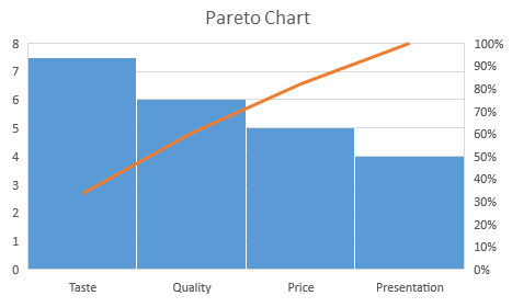
Thus, Pareto chart considers the percentage of frequency (or measure) and cumulative percentage of measures to draw a line along with bars. Also, the cumulative percentage adds up to 100.
Download BYJU’S-The Learning App and get personalised videos for many mathematical concepts to learn easily and quickly.
Frequently Asked Questions – FAQs
What is a Pareto chart used for?
How do you make a Pareto chart?
What is the 80/20 rule of Pareto charts?
How do you create a Pareto chart in statistics?
Arrange the given data in decreasing order of measures (in other words “frequency”).
Calculate the sum of measures
Determine the percentage and cumulative percentage for each cause (category of data).
List the items on the horizontal axis of a graph from highest to lowest
Label the left vertical axis with the numbers (i.e. frequency), then label the right vertical axis with the cumulative percentages (the cumulative total should equal 100)
Draw in the bars for each item
Draw a line graph of the cumulative percentages