Pictorial representation of data is called pictograph. As humanity flourished and the population increased, so did the amount of trade and transaction in the world. Ultimately, the amount of data is also increased. The merchants found it harder to keep track of the money flowing in and out of their coffers. When the population was little, trade was fairly simple but keeping track of who owes whom how much (data), so on and so forth became extremely tedious. To this end, the merchants created a bar graph with which they were able to depict a wide variety of information pictorially which not only helped understanding but also made it easier from a merchant’s point of view. What is the Bar Graph? Let’s find out.
Pictorial Representation Using Bar Graph
A bar graph also known as a bar chart is a chart that presents data that is grouped into rectangular bars. Here the length of the bar is directly proportional to the values they represent. The bar graph can be drawn vertically or horizontally. A vertical bar graph is known as a Column Bar Graph. Since one bar graph can be used to display multiple groups of data on the same graph, bar graphs can also be used as comparative tools where the length of the rectangular bar represents the value of each category. Since the rectangular bars are proportional, their differences can be spotted much more easily, visually than through words. Let’s take a closer look at bar graphs.
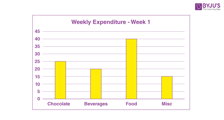
Say you have pocket money of 100 rupees every week. You are allowed to spend this amount any which way you want to. You use this money to buy chocolate, beverages, food and other miscellaneous toys and stuff. What you notice is that every week, the money just seems to disappear. You ask your father for a little more money but he instead suggests that you see where the money is going so that you can learn the value of money. To this end, you grudgingly make a bar chart. But to create a bar chart, you need to have data. You need to note down the things you are spending money on and how much. After a week you have the details of this week’s expenditure and they look something like this
| Items | Week 1 |
| Chocolate | 25 |
| Beverages | 20 |
| Food | 40 |
| Misc | 15 |
The first thing to observe is how the data is grouped. It is the first step to creating a bar graph. Similar expenses such as chocolates, candies, chewing gums are all grouped together. The same applies to the variety of soft drinks you consume. While discussing a bar graph, it was mentioned that the values are represented as a rectangular bar where the length of the rectangular bar is proportional to the value of the data. Here is where another characteristic of a bar graph comes into play.
Example
A Bar Graph needs to have a uniform scale. The scale dictates the conversion of the data in number into the rectangular format. A bar graph is the representation of numbers using bars of uniform width and length dependent on the number.
For example, if you represent the money you spent on chocolate using a 25 cm long rectangular bar then the scale is 1 rupee is equal to one unit on the graph i.e. one rupee is represented by one centimeter. But you can clearly see that for this type of representation you will need a massive graph. The thing about scale is that it is completely under our control. So instead of 25 cm, you can represent the same quantity with a rectangular bar of length 25 millimeters and here the scale is 10 rupees is equal to the same one unit i.e. 10 rupees is represented by the same one centimeter.
The interpretation of data is heavily reliant on accurate information about the scale, therefore, it is extremely important to mention the scale of your graph along both the x-axis and y-axis. Using the latter scale i.e. 10 rupees is equal to one centimeter. It is important to remember that the same scale is applied to all the groups of data in the bar graph.
Properties of Bar Graph
- The width of each bar or column in a bar graph must be equal
- The base of the bars is common in a bar graph
- The height of bars represent the data in the bar graph, proportionally
- The bars can be drawn horizontally or vertically based on the given data
Types of Bar Graphs
In pictorial representation of data, the data is represented using a bar graph. There are three types of bar graphs that can be used for pictorial representation.
- Vertical bar graph
- Horizontal bar graph
- Double bar graph
Pictorial Representation of Data using Vertical Bar Graph
Vertical bar graphs are commonly used pictorial representations to express the given data using vertical bars. Here, the horizontal axis represents the categories and the vertical bars represent the corresponding data for each category. The horizontal axis is the x-axis and the vertical axis is the y-axis.
The vertical bar graphs are also used to represent the series of data and its variation over a period of time. All the vertical bars goes from the bottom of the x-axis to the top.
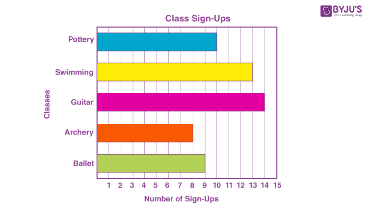
Pictorial Representation of Data Using Horizontal Bar graph
The horizontal bar graph represents the data using the bars that are parallel to the x-axis. The categories are defined along the y-axis and the respective data are represented using horizontal bars. The bars in the horizontal graph go from left to side along the x-axis.
Pictorial Representation of Data Using Double Bar Graph
You have seen what the bar graph of your expenses for the first week looks like. Say you continue this habit of tracking where you spent the money for some more time. You find that your week two expenses are slightly different from your first week. The details of the second-week expenses are;
| Items | Week 1 | Week 2 |
| Chocolate | 25 | 20 |
| Beverages | 20 | 35 |
| Food | 40 | 40 |
| Misc | 15 | 5 |
Since they all belong to the same group, they can be charted on the same bar graph. Remember that the same scale applies to all the data in the graph. Instead of charting them individually, you can place similar groups next to each other to compare the changes over a larger time span or over a larger range of data. Now plotting this together, we are better poised to see the differences between the weekly expenditure.
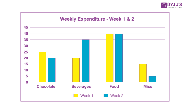
This process can also help you control your expenditure because you now know what you are spending the most on. Through this, you can judge whether your expenses are necessary.
Related Articles
- Pictograph
- Pictograph and Interpretation of a Pictograph
- Pie Chart
- Histogram
- Line Graph
- Box and Whisker Plot

Comments