The word Ogive is a term used in architecture to describe curves or curved shapes. Ogives are graphs that are used to estimate how many numbers lie below or above a particular variable or value in data. To construct an Ogive, firstly, the cumulative frequency of the variables is calculated using a frequency table. It is done by adding the frequencies of all the previous variables in the given data set. The result or the last number in the cumulative frequency table is always equal to the total frequencies of the variables. The most commonly used graphs of the frequency distribution are histogram, frequency polygon, frequency curve, and Ogives (cumulative frequency curves). Let us discuss one of the graphs called “Ogive” in detail. Here, we are going to have a look at what is an Ogive, graph, chart and an example in detail.
| Table of Contents: |
Ogive Definition
The Ogive is defined as the frequency distribution graph of a series. The Ogive is a graph of a cumulative distribution, which explains data values on the horizontal plane axis and either the cumulative relative frequencies, the cumulative frequencies or cumulative per cent frequencies on the vertical axis.
Cumulative frequency is defined as the sum of all the previous frequencies up to the current point. To find the popularity of the given data or the likelihood of the data that fall within the certain frequency range, Ogive curve helps in finding those details accurately.
Create the Ogive by plotting the point corresponding to the cumulative frequency of each class interval. Most of the Statisticians use Ogive curve, to illustrate the data in the pictorial representation. It helps in estimating the number of observations which are less than or equal to the particular value.
Ogive Graph
The graphs of the frequency distribution are frequency graphs that are used to exhibit the characteristics of discrete and continuous data. Such figures are more appealing to the eye than the tabulated data. It helps us to facilitate the comparative study of two or more frequency distributions. We can relate the shape and pattern of the two frequency distributions.
The two methods of Ogives are:
- Less than Ogive
- Greater than or more than Ogive
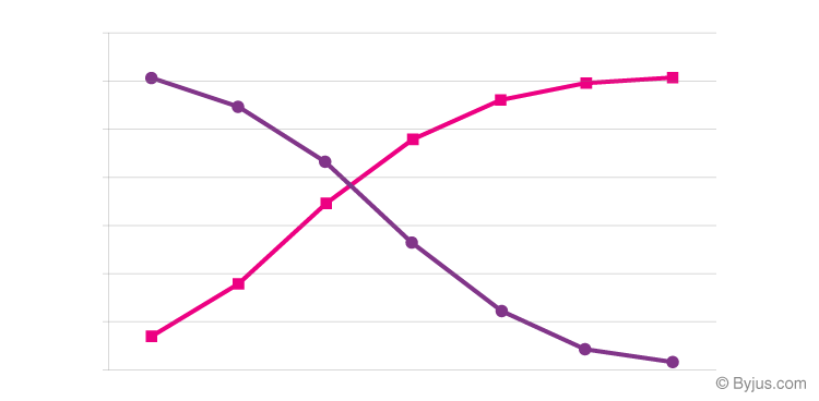
The graph given above represents less than and the greater than Ogive curve. The rising curve (Rose Curve) represents the less than Ogive, and the falling curve (Purple Curve) represents the greater than Ogive.
Less than Ogive
The frequencies of all preceding classes are added to the frequency of a class. This series is called the less than cumulative series. It is constructed by adding the first-class frequency to the second-class frequency and then to the third class frequency and so on. The downward cumulation results in the less than cumulative series.
Greater than or More than Ogive
The frequencies of the succeeding classes are added to the frequency of a class. This series is called the more than or greater than cumulative series. It is constructed by subtracting the first class, second class frequency from the total, third class frequency from that and so on. The upward cumulation result is greater than or more than the cumulative series.
Ogive Chart
An Ogive Chart is a curve of the cumulative frequency distribution or cumulative relative frequency distribution. For drawing such a curve, the frequencies must be expressed as a percentage of the total frequency. Then, such percentages are cumulated and plotted, as in the case of an Ogive. Below are the steps to construct the less than and greater than Ogive.
How to Draw Less Than Ogive Curve?
- Draw and mark the horizontal and vertical axes.
- Take the cumulative frequencies along the y-axis (vertical axis) and the upper-class limits on the x-axis (horizontal axis).
- Against each upper-class limit, plot the cumulative frequencies.
- Connect the points with a continuous curve.
How to Draw Greater than or More than Ogive Curve?
- Draw and mark the horizontal and vertical axes.
- Take the cumulative frequencies along the y-axis (vertical axis) and the lower-class limits on the x-axis (horizontal axis).
- Against each lower-class limit, plot the cumulative frequencies.
- Connect the points with a continuous curve.
Uses of Ogive Curve
Ogive Graph or the cumulative frequency graphs are used to find the median of the given set of data. If both, less than and greater than, cumulative frequency curve is drawn on the same graph, we can easily find the median value. The point in which, both the curve intersects, corresponding to the x-axis, gives the median value. Apart from finding the medians, Ogives are used in computing the percentiles of the data set values.
Ogive Example
Question 1:
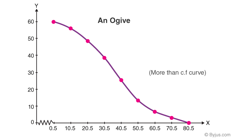
Construct the more than cumulative frequency table and draw the Ogive for the below-given data.
| Marks | 1-10 | 11-20 | 21-30 | 31-40 | 41-50 | 51-60 | 61-70 | 71-80 |
| Frequency | 3 | 8 | 12 | 14 | 10 | 6 | 5 | 2 |
Solution:
“More than” Cumulative Frequency Table:
| Marks | Frequency | More than Cumulative Frequency |
| More than 1 | 3 | 60 |
| More than 11 | 8 | 57 |
| More than 21 | 12 | 49 |
| More than 31 | 14 | 37 |
| More than 41 | 10 | 23 |
| More than 51 | 6 | 13 |
| More than 61 | 5 | 7 |
| More than 71 | 2 | 2 |
Plotting an Ogive:
Plot the points with coordinates such as (70.5, 2), (60.5, 7), (50.5, 13), (40.5, 23), (30.5, 37), (20.5, 49), (10.5, 57), (0.5, 60).
An Ogive is connected to a point on the x-axis, that represents the actual upper limit of the last class, i.e.,( 80.5, 0)
Take x-axis, 1 cm = 10 marks
Y-axis = 1 cm – 10 c.f
More than the Ogive Curve:
| Also, read: |
Practice Questions
1. Construct a more than ogive for the following frequency table:
| Class Interval | 0 – 10 | 10 – 20 | 20 – 30 | 30 – 40 | 40 – 50 | 50 – 60 | 60 – 70 |
| Frequency | 5 | 15 | 20 | 23 | 17 | 11 | 9 |
2. The following data distribution shows the data of the number of wickets taken by the bowlers in one-day matches:
| Number of Wickets | Less than 15 | Less than 30 | Less than 45 | Less than 60 | Less than 75 | Less than 90 | Less than 105 | Less than 120 |
| Number of Bowlers | 2 | 4 | 5 | 17 | 39 | 54 | 70 | 80 |
Draw a less than type ogive.
Stay tuned with BYJU’S – The Learning app and explore more Maths-related videos to learn with ease.
Frequently Asked Questions on Ogive
What is an Ogive?
An ogive is a freehand graph drawn curve to show the cumulative frequency distribution. It is also known as a cumulative frequency polygon.
What are the two types of ogive graphs?
The two types of ogives are less than ogive and greater than or more than ogive. In a less than ogive, the frequencies of all preceding classes are added to the frequency of a class. In a more than ogive, the frequencies of the succeeding classes are added to the frequency of a class.
How to draw a less than ogive?
Following are the steps to draw a less than ogive:
1. Draw and mark the horizontal and vertical axes.
2. Take the cumulative frequencies along the y-axis (vertical axis) and the upper-class limits on the x-axis (horizontal axis).
3. Against each upper-class limit, plot the cumulative frequencies.
4. Connect the points with a continuous curve.
How to draw a more than ogive?
Following are the steps to draw a more than ogive:
1. Draw and mark the horizontal and vertical axes.
2. Take the cumulative frequencies along the y-axis (vertical axis) and the lower-class limits on the x-axis (horizontal axis).
3. Against each lower-class limit, plot the cumulative frequencies.
4. Connect the points with a continuous curve.