Data Interpretation deals with the understanding, organizing and interpreting of the given data so as to arrive at meaningful conclusions. This article covers the 3 step process involved in Data Interpretation and lucidly covers details on 3 major data presentation techniques like Bar graph, Line Graph and Pie Charts. Each of these 3 types is further subdivided, which is explained in this article.
Aspirants would find this article very helpful while preparing for the IAS Exam.
| Aspirants should begin their preparation by solving UPSC Previous Year Question Papers now!!
To complement your preparation for the upcoming exam, check the following links: |
Data Interpretation – 3 Step Process
Data Interpretation skills are important for Civil Service aspirants, which they would need it on a daily basis. A civil service officer is expected to have good control over the analysis of data and deduction of meaningful conclusions from the myriad representations of information. Honing your skills in Data Interpretation is a three-step process:
- Understanding the different modes of representation of data and linking of information across two or more graphs.
- Improving your calculation speed.
- Practice to perfection so that you learn to pick the right questions and maximize your attempts with good accuracy.
Data Presentation – Different Types of Bar Graphs, Line Graphs & Pie Charts
Data can be represented in a multitude ways, including tables and different charts. We will look at the different representations of data in this section.
Bar Family
A bar chart or bar graph is a chart with rectangular bars with lengths proportional to the values that they represent. The bars can be plotted vertically or horizontally. Bar charts are used for plotting discrete (or ‘discontinuous’) data which has discrete values and is not continuous.
Simple Bar Graph
Look at the example below. The Y-axis denotes the points scored by Teams A, B & C over the years 2003-2006. For eg, Team A scores 25 points in the year 2004.
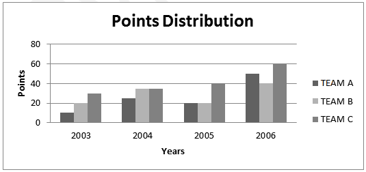
Figure 1 Simple Bar Graph plotted vertically
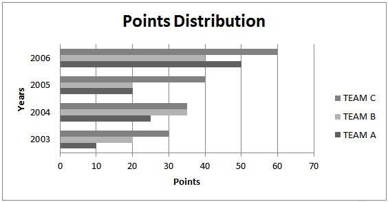
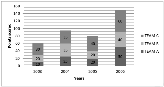
Figure 2 Simple Bar Graph plotted horizontally 1b)Cumulative/Stacked Bar Graph is a graph that is used to compare the parts to the whole. The bars in a stacked bar graph are divided into categories. Each bar represents a total. In the example below, in the year 2005, team A scores 20% of the available points, team B scores 20% of the points and Team C scores 60% of the points.
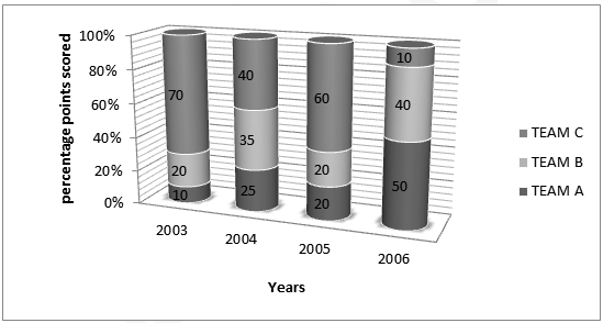
Figure 3 Cumulative Bar Graph (percentage-based)
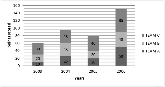
Figure 4 Cumulative Bar graph-Value Based
Line Family
A line chart or line graph is a type of graph, which displays information as a series of data points connected by straight line segments. It is a basic type of chart common in many fields. It is an extension of a scatter graph and is created by connecting a series of points that represent individual measurements with line segments. A line chart is often used to visualize a trend in data over intervals of time – a time series – thus the line is often drawn chronologically.
Scatter Graph
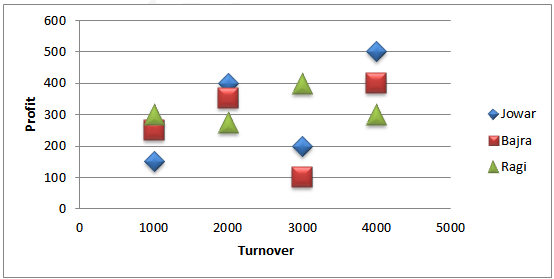
A scatter plot or scatter graph is a type of mathematical diagram using Cartesian coordinates to display values for two variables for a set of data. The data is displayed as a collection of points, each having the value of one variable determining the position on the horizontal axis and the value of the other variable determining the position on the vertical axis Each point in the graph below shows the profit and turnover data for a company. Each company belongs to one of the three food commodity industries-Jowar, Bajra and Ragi.
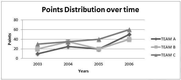
Simple Line Graph
In the example below, it can be seen that Team A scores 10 points in 2003, 25 points in 2004, 20 points in 2005 and 50 points in 2006.
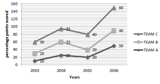
Stacked Line Graph/ Band Diagram
A stacked line graph or a Band Diagram is a line chart in which lines do not overlap because they are cumulative at each point. A stacked line chart displays series as a set of points connected by a line. Values are represented on the y-axis and categories are displayed on the x-axis. You can read it similar to a stacked bar graph In the example below, Team A scores 10 points in 2003, Team B scores (30-10) 20 points in 2003 and Team C scores (60-20-10) 30 points in 2003.
The same data, for clearer understanding, is represented in a stacked bar graph as follows
Cumulative Line Graph
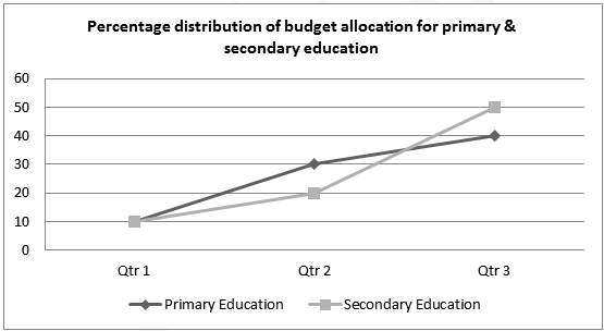
To read a cumulative line chart, the values are “Accumulated” or “Added on” to those of the previous data point in the chart. Look at the example below. In the first quarter, both Primary and Secondary education comprises 10% of the budget allocation. In the second quarter, the budget allocation for Primary Education becomes 20% (30-10) and the budget allocation for Secondary Education becomes 10% (40-30).
Pie Family
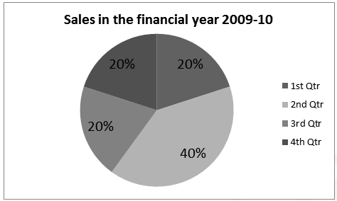
A pie chart (or a circle graph) is a circular chart divided into sectors, illustrating proportion. In a pie chart, the arc length of each sector (and consequently its central angle and area), is proportional to the quantity it represents. Together, the sectors create a full disk. The pie chart is perhaps the most ubiquitous statistical chart in the business world and the mass media. Pie charts can be an effective way of displaying information in some cases, in particular, if the intent is to compare the size of a slice with the whole pie, rather than comparing the slices among them.
Exploded Pie Chart
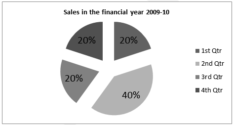
A chart with one or more sectors separated from the rest of the disk is known as an exploded pie chart. This effect is used to either highlight a sector or to highlight smaller segments of the chart with a small proportion.
Doughnut Chart
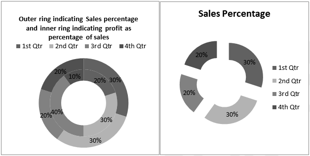
A doughnut chart (also spelt donut) is functionally identical to a pie chart, with the exception of a blank centre and the ability to support multiple statistics as one. There are 2 types of doughnut charts, doughnut and exploded doughnut.
The above details would help candidates prepare for UPSC 2023
Related Links
| IAS Salary | UPSC Syllabus |
| Union Cabinet Minister | India Sri Lanka Relations |
| First President of Congress | UN Formation |
| Pala Dynasty | NITI Aayog PDF |
Comments